
I have allergies. Hay fever, whatever you want to call it. And I don't know WHAT I'm allergic to.
To figure that out, I need everything in the air on one screen, broken down by plant, next to how I actually feel that day. I've looked everywhere. I had Claude look everywhere. There isn't a site that exists that shows me everything. Every one I tried showed part of the picture. One has air quality. Another has pollen, but lumped into "trees" and "grass." Nobody has mold. Almost nobody tracks Saharan dust or smoke.
That dust matters to me. It blows off the Sahara, crosses the Atlantic and lands on Texas. Every time a plume comes through, my eyes itch like crazy. Most of the sites I checked couldn't even tell me a plume was here.
So, of course, I had to build my own dashboard. The build turned out to be the easy part. What I learned before I built it is the reason why this post exists.
Research first
I didn't open a code editor first. I had Claude send five research agents out in parallel: air quality feeds, pollen, mold, Saharan dust and smoke, and a survey of every existing air dashboard I could name.
The verdict: nothing does all of it. IQAir came closest, and it still has no plant-level pollen, no mold and no Saharan dust.
Then the finding that changed the plan. Fredericksburg has no official air monitor. The closest one is in San Antonio, 66 miles away.
That means every air quality number you've ever seen for Fredericksburg is a model, not a measurement. A computer estimated it. Most sites don't tell you that. They show you "53" in the same font, same color and same size as a number a real instrument measured this morning.
If I'd skipped the research, I would have built a nice-looking page on top of a number that's really an educated guess from 66 miles away, and I'd never have known.
What I built
One page. Five data sources. About 2 hours from first question to live URL (8:21am to 10:24am), and it runs for about $2 a month.
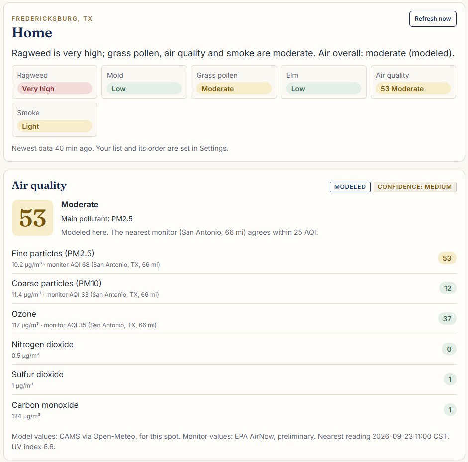
Here's what it does:
- Pulls air quality, pollen by plant, mold, Saharan dust, smoke and fire from five sources every 15 minutes
- Shows all of it on one screen, with a five-day forecast
- Sends me an email at 6:30am with today's summary
- Alerts me when something crosses a line I set
- Keeps a symptom log. I score each day 0-5 (0 = great, 5 = miserable), and it saves that day's pollen, mold and air levels alongside the score
That last one is the real point. After a few weeks, the log should show which allergens line up with my bad days. That's how I find out what I'm actually allergic to.
The sources, for the curious: EPA AirNow for official readings, Open-Meteo for modeled pollutants, Saharan dust and weather, Google Pollen for pollen by plant, AccuWeather for mold and a second opinion on pollen, and NOAA satellite data for smoke and fire. Claude Code wrote it. I reviewed every piece and made the calls.
Label every number
This is the part I'd tell any business owner about, allergies or not.
Every number on my page says three things besides the number itself:
- Where it came from. Measured by an instrument, modeled by a computer, or seen by a satellite.
- How old it is. "Newest data 40 min ago" sits right on the page.
- How much to trust it. Every card carries a confidence level. Nothing modeled is ever allowed to show high confidence.
Two rules sit on top of that. If a source hasn't updated in twice its normal window, the page shows "stale" instead of a number, and a stale number never sets off an alert. And when two sources disagree, the page says so instead of quietly picking one.
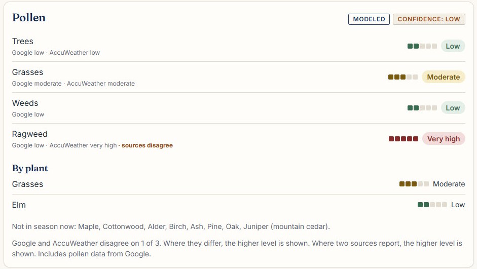
Look at the ragweed line. Google says low. AccuWeather says very high. That's a big gap. The page shows the higher reading and flags "sources disagree" right next to it, so I know that number is shaky before I plan my day around it.
A dashboard that hid that disagreement would look cleaner. It would also be lying to me by leaving something out.
Your business has the same problem
Most business dashboards mix measured numbers and modeled ones and give them equal weight.
- Ad platforms. Facebook and Google both fill gaps in conversion tracking with modeled conversions. Your "42 conversions" might be 30 counted and 12 estimated.
- Forecasts. A sales forecast is a model. It usually sits in the same spreadsheet, in the same font, as last month's actual revenue.
- Pipeline. "$180k in pipeline" is somebody's guess about who will sign, added up.
- Stale reports. A report somebody rebuilds every Monday is a week old by Friday, and nothing on it tells you that.
None of those numbers are wrong to have. They're wrong to trust the same way you trust cash in the bank.
Here's the quick check. Pick the report you look at most and ask three questions about each number on it:
- Was this measured, or estimated?
- How old is it?
- Where did it come from, and does anything else disagree with it?
If you can't answer those in a few seconds, the report is hiding something from you. Probably not on purpose. But hiding it all the same.
Most businesses skip straight to Build
I've written before about the order I run every project in: Research, Analyze, Plan, Build, Ship. This little dashboard is the smallest example I've got of why Build is step four.
The whole thing took about 2 hours. The research is where the value was. It's what told me my own town's air quality number was a guess, and it's why every number on the page now tells me whether to trust it.
If you have a dashboard or a report you make decisions from and you're not sure which of its numbers are real, that's the kind of thing I look at. Send me a note through the contact page and tell me which number you trust least.
Not medical advice. Talk to your doctor about allergy and asthma decisions.